
QUICK LINKS
Presentation Design • Facilitation Advice • Supplemental Electronic Materials
Purpose
The purpose of this guide is to empower our membership to design program sessions, meetings, materials, and other ACPA experiences that are accessible to all participants. In developing this guide, we draw from the Seven Principles of Universal Design: Equitable Use, Flexibility in Use, Simple and Intuitive Use, Perceptible Information, Tolerance for Error, Low Physical Effort and Size and Space for Approach.
We also draw from the Principles of Universal Design for Learning: Provide Multiple Means of Representation, Provide Multiple Means of Action and Expression, Provide Multiple Means of Engagement.
How to Use this Guide
This guide provides several considerations that make learning environments more accessible for participants. Most items on this list are possible to incorporate with minimal foresight and intentionality. There may be some items that are not possible to implement due to circumstances out of your control. At these times, we suggest you acknowledge this limitation to the participants prior to delivery and if needed, be creative to find alternate ways to be sure that the session continues to be as accessible as possible.
Presentation Design
It is recommended you use PowerPoint when creating your presentation and use this ACPA Presenter Template as it has been reviewed for accessibility. As a reminder, all presenters agreed to upload session materials as part of submitting a program proposal and accepting the invitation to present.
PowerPoint from 2010 and later (Windows) and 2016 and later (Mac) contain a built-in Accessibility Checker when running the software. This feature is great to utilize while creating your presentation to make sure you are incorporating accessibility concerns into the design of your presentation.
Visit the Supplemental Materials section for information on how to run the Microsoft Office Accessibility Checker.
Evidence-based principles
A presentation slide should accomplish one of the following tasks. If a slide does not meet one or more of these criteria, consider using another medium (Niemer, 2014).
-
Introduce important or complex content.
-
Present a content-relevant graphic image you will describe and explain to the audience.
-
Display a brief quote you read to the audience and either unpack or expand upon.
-
Present information that cannot be easily explained orally.
-
Connect to content across slides.
Initial slides may provide an outline of the session and introduce important concepts.
Further slides should fall into one of two categories (Garner & Alley, 2013, 2016; Mayer, 2014; Overson, 2014):
-
Evidence toward an assertion. Slides present an assertion (either at the top of the slide or verbally) with a graphic or summary text that explains that assertion. The slide content is then described and explained in detail verbally.
-
Slides that signal key concepts or define key terms. Such slides present a quotation, definition, or graphic, and set it apart via a box, an arrow, or change in text color. The presenter then spends time unpacking the meaning of the presented content
Regardless of the type of slide, the content should be kept simple (Mayer, 2014; Overson, 2014):
-
Your oral presentation and the text of your slides should be different, with the text of your slides being a smaller component of your oration.
-
All slides should present the content in a simplified manner, reducing the effort of both the presenter and the session attendees of connecting the presentation content to the visual aid.
-
Narration should reference and draw from the slides immediately present, as though you are in conversation with the presentation.
-
Avoid using animated transitions or flashing images: opt instead for auditory transitions.
General advice on slide design and accessibility
-
Maintain similar text formatting throughout the presentation, unless you are highlighting important material.
-
Sans serif fonts (e.g. Arial, Calibri, Verdana) are easier to read than serif fonts (e.g. Book Antiqua, Century, Times New Roman).
-
Fonts should be no smaller than 20-point.
-
Include alt text in the slide design for all images, shapes, charts, and graphs, and read these descriptions as you are presenting. To add alt text in PowerPoint, select on the image, right click, and select “Edit Alt Text” from the menu that displays.
-
Avoid the use of tables as they are difficult for screen readers to follow. If you absolutely must use a table, include alt-text that fully describes every cell in the table. Do not merge cells. Column and Row headers are required.
-
Video and audio media should always be captioned. If there are no captions available, the video should not be used.
-
Use colors on opposite ends of the color spectrum and starkly contrast each other. Avoid combinations difficult for participants with colorblindness to see as they are similar in hue or spectrum location (i.e. Green & Red; Green & Brown, etc.)
-
Number each slide, and include these numbers in the notes.
-
Set a Reading Order on your slides. Screen readers will read the content in this order. Placeholder content on template slides is already in proper reading order. Content manually inserted in a slide will be read in the order it is added. To check the reading order of a slide in PowerPoint Select Home>Arrange>Selection Pane. Content is read in reverse order (bottom to top). Click and drag items to order.
-
Use descriptive links. If you must hyperlink to another resource describe the link and hyperlink those descriptive words such as ACPA Convention rather than links that say “Click Here” or “More Info”.
Examples of slides that apply the principles above are offered below
adapted from the Assertion-Evidence Approach
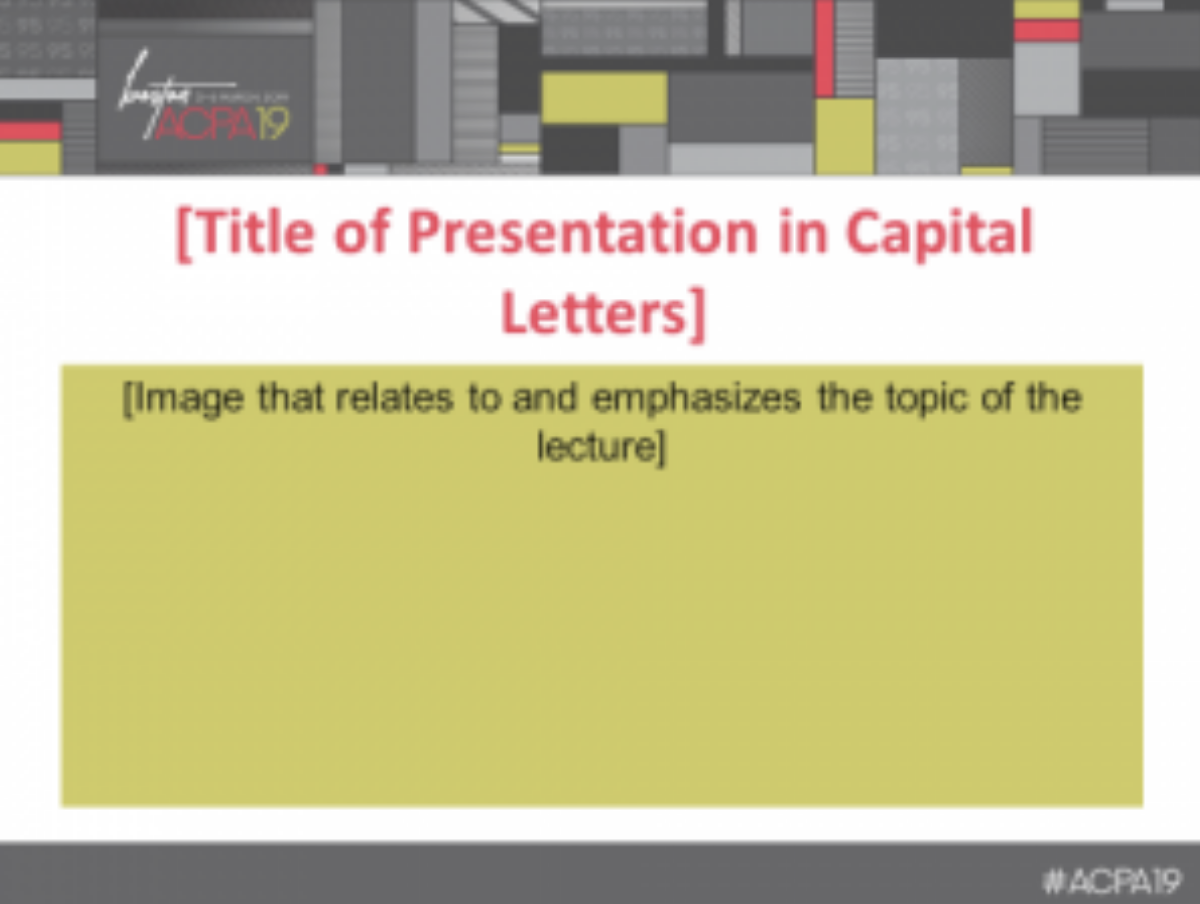
Image 1 is of a presentation slide where the heading bar is a multicolored bar of various grays, yellow, red, and black. There is a logo in the upper left corner for ACPA19: Boston, 3-6 March, 2019. The footer is a gray bar that contains the hashtag “ACPA19” in the right corner. Below the heading bar, in large red text is a placeholder for “Title of Presentation in Capital Letters.” Below that, in a yellow box, text reading “Image that relates to and emphasizes the topic of the lecture.”
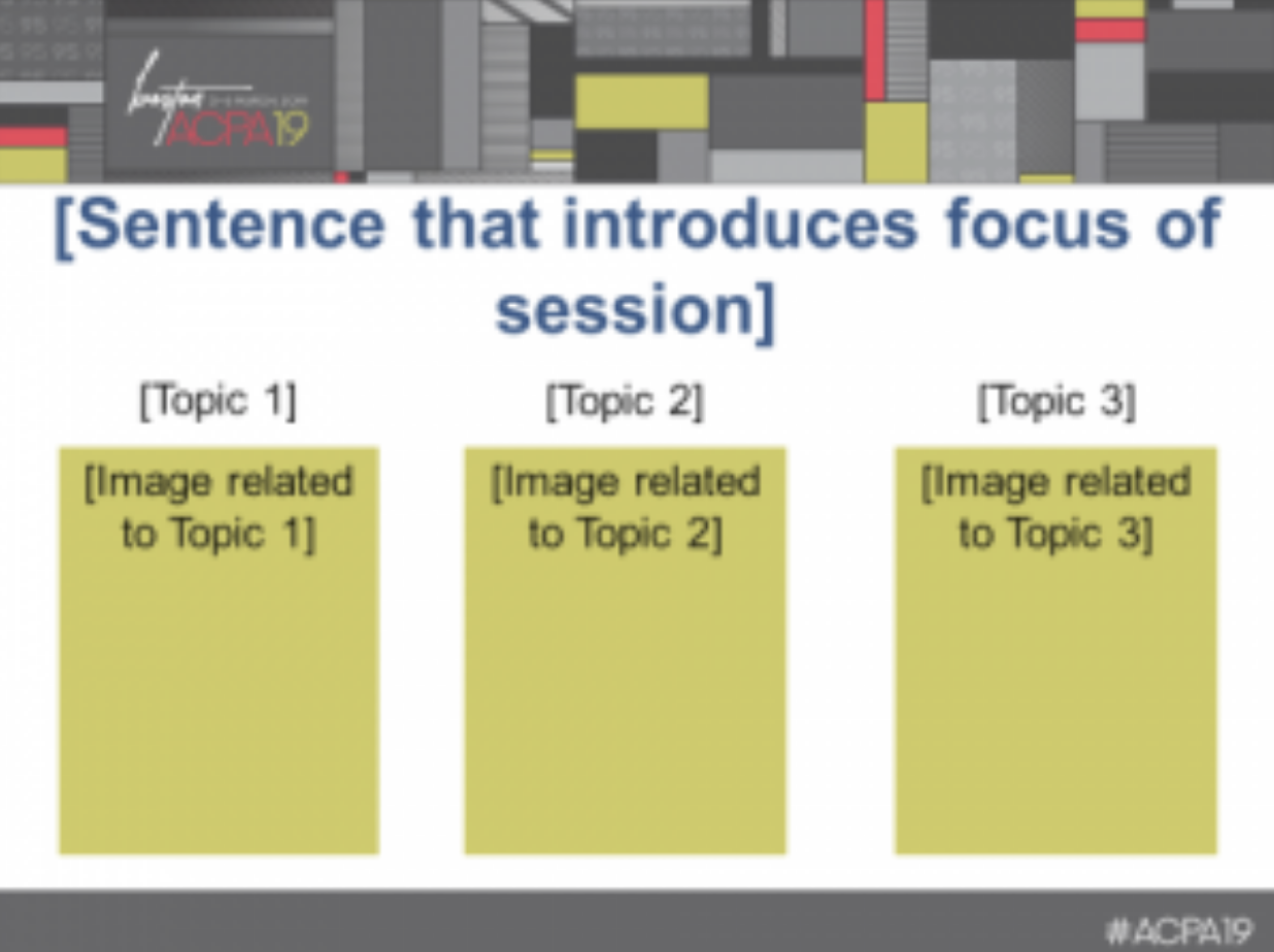
Image 2 is of a presentation slide where the heading has a placeholder for a slide title: “Sentence that introduces the focus of the lecture.” There are three columns below the titles, labeled for three lecture topics: “Topic 1,” “Topic 2,” and “Topic 3.” Underneath each column header are yellow boxes labeled “Image related to Topic 1,” “Image related to Topic 2,” and “Image related to Topic 3.”
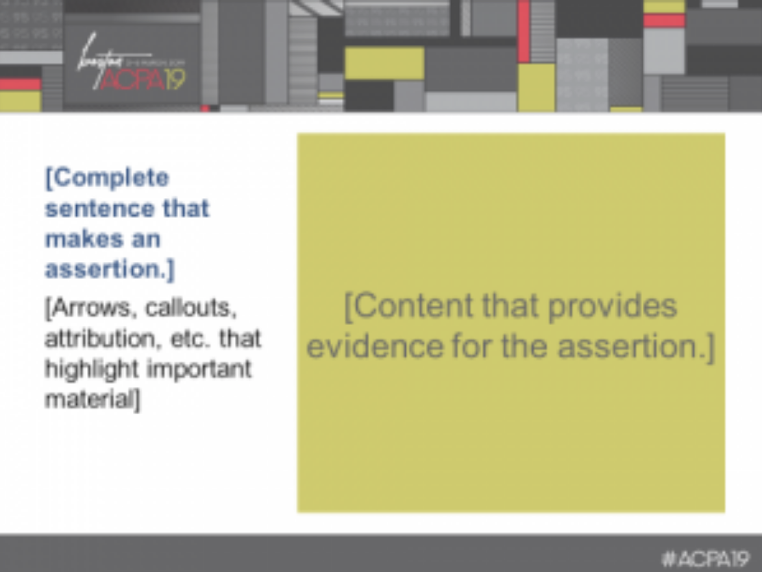
Image 3 is of a presentation slide where the title is on the left in large blue text “Complete sentence that makes an assertion.” Underneath the title of the slide is a text placeholder for “Arrows, callouts, attribution, etcetera, that highlight important material.” On the right, a yellow box contains a text placeholder for “Content that provides evidence for the assertion.
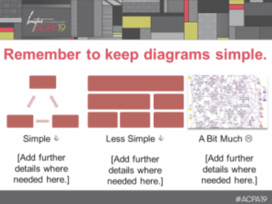
Image 4 is of a presentation slide where the title of large red text reads “Remember to keep diagrams simple.” Below the heading are three images, each with a caption. The first is of three rectangular red blocks arranged as a pyramid, with two, two-way arrows connecting the box at the top of the pyramid with the two boxes at the bottom of the pyramid. A third two-way arrow connects the two boxes at the bottom of the pyramid. Underneath the diagram, the caption reads “Simple” with a thumbs up symbol. Beneath the caption is placeholder text where one can “Add further details where needed here.” The second image is of three layers of stacked red boxes. Three boxes of equal width on the bottom, two boxes on the next layer where one is twice the width of the other. One large box that is the width of the two other layers sits on top. The caption reads “Less Simple” with a thumbs up symbol. Beneath the caption is placeholder text where one can “Add further details where needed here.” The third image is of a series of tightly packed, red and yellow labeled purple circles, with a number of arrows connecting the circles. The image is so dense so as to be illegible. The caption reads “A Bit Much” with a sad faced emoji. Beneath the caption is placeholder text where one can “Add further details where needed here.”
[Note: However you design your presentation, fully describing visuals and unpacking definitions or quotes will be helpful for all session attendees.]
Facilitation:
Use a microphone for amplification. Test your microphone prior to the presentation and ensure that the microphone you are using is as close as possible to your mouth or the optimal distance for the microphone.
Provide a clear and concise outline of presentation for attendee note taking.
-
An outline signals to participants the order in which material will be covered, and prepares them to build connections between concepts.
Use multiple methods to meet the needs of various learning styles including: visual-linguistic (reading and writing), visual-spatial (graphs, videos and pictures), auditory (listening), and kinesthetic (touching and moving).
-
For example, you might describe a theoretical framework, and then provide a visual model of the manner in which the framework operates so that attendees can conceptualize the process’s components in one space.
Use stories and examples to illustrate concepts.
-
For example, when describing the outcomes of a program, offering an anecdote of a student’s success alongside descriptive statistics allows participants to understand the outcome’s elements.
Balance theory and practical applications with explicit examples.
-
For example, when describing a topic as broad as microaggressions, use examples of the different types of microaggression as well as how they might manifest differently for different social groups. Such examples need not be exhaustive, but a few allow participants to transfer knowledge between examples.
Connect new information and concepts to previous points.
-
Be explicit about how a concept discussed in the 40th minute of the session connects back to concept in the beginning. For example, how is a microaggression related to implicit bias?
Offer resources so that participants may regulate their own learning.
-
Some learners require more time to process information and/or may need more background in a topic. Offering resources such as handouts that allow space for note-taking or a list of additional resources allows both you and the learner to balance breadth and depth of the content covered in a way that respects your mutual agency.
Activities for Engaging Participants
Although presenting material in a clear and precise manner makes it more accessible, providing multiple means for engagement, action, and expression involves opportunities for participants to work directly with your session’s content and improves their capacity to learn. Such opportunities involve translating your content into their own words and thinking through how its principles might apply to their work. To those ends, each of the following techniques are commonly used by college faculty to effectively support the learning of students who might not learn best through routine, slide-and-lecture based presentations (adapted from Barkley & Major, 2016). Some of the options below will work well for live sessions or meetings in particular, while others are options for live or pre-recorded sessions or meetings.
Polling. Polling requires session participants to select an answer from a series of responses pre-determined by you, the facilitator. Answers are typically aggregated to understand where the group falls in terms of agreement. There are multiple, free online platforms to use, or you can prepare packets of contrasting color paper and ask participants to display their chosen answer during your session. Polls are helpful as quick mechanisms for assessing opinion, understanding, and interest, and are useful if you feel you do not have the time to engage participants in more time-consuming conversation-based activities. This tool allows for clarification of material and for engaging participants who might need time to process or prepare prior to engaging in discussion.
Minute papers. Minute papers are brief prompts for written reflection that solicit participant reactions to the material. How might the content be useful for their work? What are aspects they are struggling to understand and might want to learn more about? Similar questions specific to your program may be printed on handouts to help attendees organize their thoughts before a large group question-and-answer session. This activity and think-pair-share below helps folks who may not be confident speaking up, struggle in social situations, or may still be processing your content to prepare for engaging with a larger group.
Think-pair-share. Prompts for a think-pair-share are similar to those for a minute paper, but require participants to reflect individually before sharing with one other person or small group of people. A representative from that pairing would then share a summary of the group’s collective thoughts. Similar to the minute paper, this activity helps participants process and organize their reactions to your content, while also scaffolding engagement in more manageable units.
Case studies. Case studies are scenarios that offer a realistic context or problematic situation in which to apply the content discussed in your program. They should present a description of the scenario (relevant to your program’s content), and sufficient information for participants to be able to decide how they might want to apply the content recently covered. Guiding questions should be included alongside the case study help participants process the scenario and reach a solution:
-
What is the problem presented? What are important contextual elements?
-
What information do you wish was provided? How might it be found?
-
What needs to be done in this scenario?
-
What are some strategies offered in this session or relevant from your own experience that might be useful?
-
How will you evaluate the success of your proposed strategies?
Case studies can work in a variety of group sizes – depending on your comfort level and that of your participants – but you may wish to include some large-group processing at the end to share knowledge.
Think alouds. Think aloud problem solving is similar to using a case study, except the exercise is done in pairs, usually with two scenarios. Participants take on one of two roles: the problem solver or the listener. The problem solver verbalizes their analysis and proposed solution to the scenario, while the listener records each step and the rationale associated with said step. At the conclusion of each problem, the room is polled and pairs volunteer the solution(s) the problem solver generated before switching roles for the next problem. This activity is useful for sessions where there may be multiple case studies or problems you wish everyone to work through, but do not want to inadvertently pressure large groups to process.
Supplemental Electronic Materials
Microsoft Office software features a built in Accessibility Checker. This tool will help to ensure that any documents or presentations you create are taking into account the different types of users who will interact with your document. As part of ACPA’s continuing efforts to make our programs and services accessible to all members, we ask you take some time to familiarize yourself with the Accessibility Checker.
Checking Accessibility
How to Use the Accessibility Checker on Windows:
-
Click File > Info. If the Accessibility Checker sees any potential issues, you will see a message next to the Check for Issues button or under the Inspect Document heading, located in the middle of your screen.
-
To view and repair the issues in your file, click Check for Issues > Check Accessibility. Your file reappears, and the Accessibility Checker task pane shows the inspection results. Click a specific issue to see Additional Information and steps you can take to change the content.
How to Use the Accessibility Checker on Mac:
-
Click Review > Check Accessibility.
-
The Accessibility Checker task pane shows the inspection results. Click a specific issue to see why you should fix the issue and steps to take to change the content. Each issue is classified as an Error, Warning, or Tip.
Notes
Errors: An error is for content that makes a file very difficult or impossible for people with disabilities to understand.
Warning: A warning is for content that in most, but not all, cases makes a file difficult for people with disabilities to understand.
Tip: A tip is for content that people with disabilities can understand, but that might be better organized or presented in a way that would improve their experience. Fixing some issues might require you to change, reformat, or update your content. The Accessibility Checker also lets you know about Office features you can use to make your content more accessible.
THE ACCESSIBILITY CHECKER DOES NOT CATCH EVERYTHING!! Use it to double check your work but remember that it will not catch everything.
Converting an Accessible File to PDF
Visit WEBAim PDF Accessibility for the steps for converting an accessible file (Word document or PowerPoint file) to PDF.
Sources:
Barkley, E. F., & Major, C. H. (2016). Learning assessment techniques: A handbook for college faculty. San Francisco: Jossey-Bass
Garner, J. K., & Alley, M. P. (2012). How the design of presentation slides affects audience comprehension: A case for the assertion-evidence approach. International Journal of Engineering Education, 29(6), 1564-1579.
Garner, J. K., & Alley, M. P. (2016). Slide structure can influence the presenter’s understanding of the presentation’s content. International Journal of Engineering Education, 32(1a), 39-54.
Mayer, R. E. (2014). Research-based principles for designing multimedia instruction. In V. A. Benassi, C. E. Overson, & C. M. Hakala (Eds.). Applying science of learning in education: Infusing psychological science into the curriculum (pp. 59-70). Retrieved from http://teachpsych.org/ebooks/asle2014/index.php
Mayer, R. E., & Moreno, R. (2003). Nine ways to reduce cognitive load in multimedia learning. Educational Psychologist, 38(1), 43-52.
Niemer, R. [CRLTeach]. (2014, January 24). PowerPoint based on the science of learning [Video File]. Retrieved from https://youtu.be/39FIZt9hqNY
Overson, C. (2014). Applying multimedia principles to slideshows for academic presentation. In V. A. Benassi, C. E. Overson, & C. M. Hakala (Eds.). Applying science of learning in education: Infusing psychological science into the curriculum (pp. 252-258). Retrieved from http://teachpsych.org/ebooks/asle2014/index.php
Additional Resources:
Colorado State University – Access to Postsecondary Education through Universal Design
CAST: The Universal Design for Learning Guidelines
North Carolina State University’s The Center for Universal Design